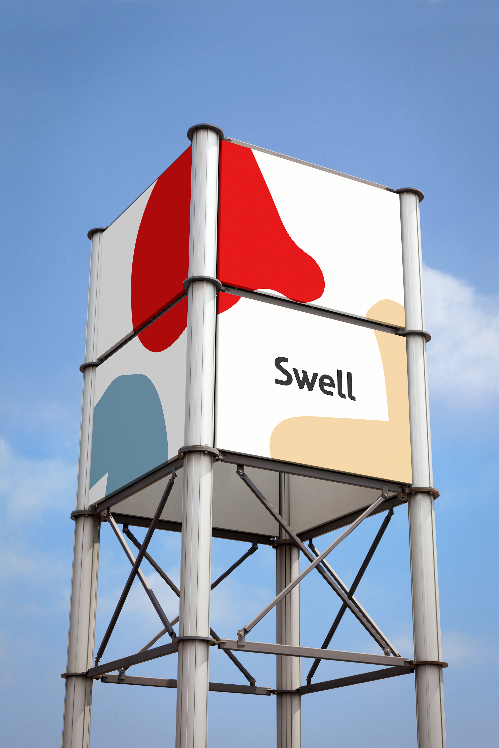
Swell
Brand Identity
Type 5 / 2019
Instructor: Rudy Manning
Swell is a reusable water bottle brand. I revisited Swell’s brand strategy, looking beyond the next 10 years in order to reimagine how the brand can evolve and stay relevant once customers have had their Swell bottles for over a decade. The goal of reusable water bottles is to reduce waste and provide a product intended for long-term use. But how else can Swell continue and expand its mission to be a sustainable brand.


I created a typeface based on the fluidity of water. Using actual water to make unpredictable and fluid-like forms, I created this typeface, which became the basis of the brand identity system.

Graphic elements take on a consistent visual language as the typeface.


“Wells” are hypothetical water filters that dispense water into reusable water bottles.


“Oasis” is a hypothetical pop-up space where patrons can have water tastings with a water sommelier and learn about different types of water and responsible water sourcing.
